


We Love Aviation
Our approach is simple. Our purpose clear. We put everything we love about life into our work and we work at what we love every single day.
Here, we are all part pilot, part artist, part visionary and part dreamer. Our talented people are driven by their passion for aviation.
Air travel brings people home for the most important moments in life. It has made the world small. Millions are employed in connecting us together in ways that were never possible prior to flight. Where airplanes land, opportunities take off.
We know that to understand the aviation industry, you have to live it.
Big Agency Experience
All of our employees and partners have managed millions of dollars of media on behalf of clients across multiple industries.
Done It All
From a small coupon ads to Super Bowl commercials, we've done it all. We know what channels to use and how it will impact your revenue stream.
Global Clients & Talent from Everywhere
We have clients across the world. To service them, we have a team of partners across the US and around the world.
We Chose You
We could have worked any sector (and we have). We chose aviation because this industry, its people, and the value it creates, is remarkable and we think everyone should know it.
Aviation Marketing That Matters
The Aviation Agency is expert at linking marketing activities to sales.
Our competitors often separate these activities – not knowing how to do either particularly well. The result is unfortunately predictable – unhappy clients, failed campaigns, and aviation companies that languish.
We fuse these disciplines to create a powerful tool that lets you talk directly to your customers, engage prospects at scale, measure the effectiveness of your efforts, and turn interest into action.
Our approach to aviation marketing creates engaging strategies that support sales and allow you to control the conversation.
We understand aviation, avionics, and aerospace companies. Their sales processes are different than just standard B2B (or B2C). The customer is always considerably more discriminating. The competition is always relentless. The margins for error are as thin on the ground as they are in the air.
We roll up our sleeves and we solve these problems for our clients. We know how to use marketing to gain share from customers, build awareness in the marketplace, and motivate people to buy. We can build a suite of marketing technologies and process that appeal to the analytical and demanding nature of those who lead aviation industry companies.
We are an authority on connecting customers and companies. Our methods allow you to cut through the clutter and take control in the sales process. We know how to talk to aviation industry customers (both consumers and business leaders) when they are making buying decisions.
Through results-driven strategies and processes, we get people excited about aviation technologies and services and use that emotion to bind them to our clients.
We are experts at marketing, but we love aviation.
We think everyone should too.
The Spirit of Flight™

The most iconic logos satisfy several key characteristics – they’re simple, they’re tied to emotion, and they resonate. These three elements were central to the story of designing our own brand’s logo. We didn’t want to design yet another “airplane” logo. We were focused on something much deeper than props and airfoils.
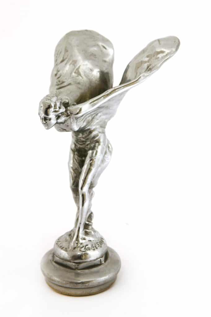
Ultimately inspired by Charles Robinson Sykes, our logo, which we call the “Spirit of Flight,” captures the very emotion we all share about flying.
Because once you have touched flight
that is where the heart longs to be.
That is why flight is the backbone of modernity and our civilization.
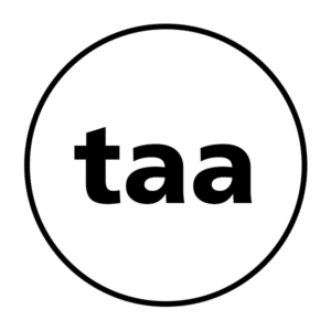
Our original logo (taa) was inspired by the design work and background that goes into airport fonts and signage.
You may not be aware of this, but airport fonts are highly specialized. This type of signage, known in design and art as “wayfinding” has to meet specific requirements about being seen, being read, and being understood in the fastest manner possible. Thus, wayfinding signage is always highly intuitive, high contrast, and communicates with pictures, colors, and minimal words.
Keenly identifying with that clarity, our original logo would be at home with an airport. Designed like “wayfinding signage,” our first logo was clean, crisp, and very clear. It was based on one of the three fonts routinely used in airport signage (which are Avenir, Frutiger, and Helvetica if you were wondering). Our logo looked like a sign – adapted of course for the requirement of social media (being rounded and being 1080 by 1080). Our wordmark was Avenir. Our sign Fruitger.
Life was good – but we weren’t completely happy with the logos. It just didn’t “speak to us” in terms of who we were and why.
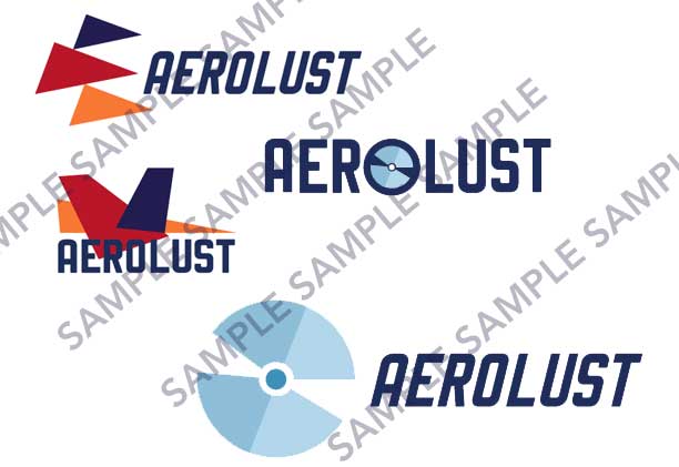
A long-term marketing strategy that our agency is undertaking is the building of an affinitive media property called Aerolust. Aerolust was based in part on an amazing website for high-end sports cars called “Petrolicious”. Our idea was that we were going to build a “Petrolicious” for airplanes.
So we started noodling Aerolust and what that symbol should look like. That journey would take us down the road of ultimately finding our brand.

For all your "agency needs" (bleech)
We studied a LOT of logos for airlines, aviation companies, charters, and the like. Predictably, these logos were largely a combination of props, wings, hulls, airplanes, etc., etc., etc., etc.
Our founder (Bryan) said, “They all have about as much panache and subtlety as a sledgehammer blow to the crotch.”
That was true – they weren’t very inspired – mostly literal.
So the creative team was asked to focus on how flying made them feel and the emotional moment people and pilots get looking at airplanes. These magnificent machines that take millions of dollars and man hours to build and design.
Bryan said to the team, “I want something that represents the design of aircraft and the feelings of how it feels to sit in the seat while in command. It needs to capture that emotional irrationality of why pilots fly and why those who love aviation love it so much. It’s about freedom – not propellers or wings.”
The first drawings that came back would have been epic for any airliner (we can’t share them all because who knows, we may use them someday). Bryan looked at them and said,
“Yeah, these are all good. But we’re not an airline. We’re ‘Mad Men.’ We want people to feel – but not say ‘oh they’re a charter.’”
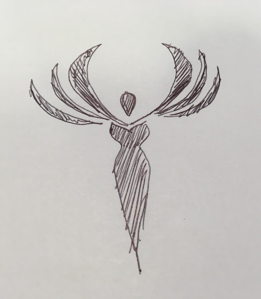
So the art team went back to the drawing board. Producing more sketches. Finally, a prototype sketch of what would later become the basis of the final design came forth as a doodle.
“I like that one – there’s something to it. I don’t know what it is, but that one has something to it.”
Our Creative Director, Troy, agreed – “Yeah there is something to it.”
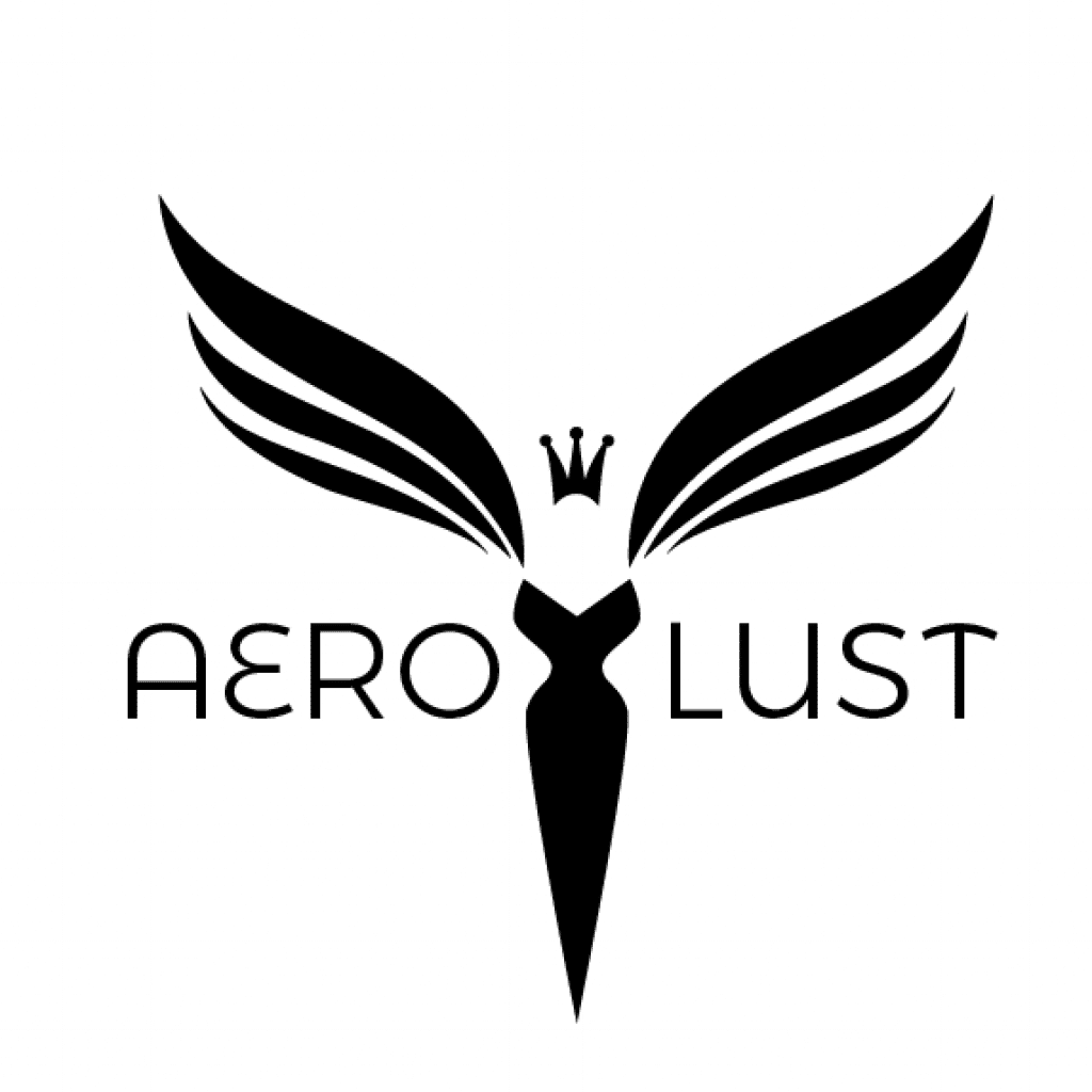
Two more weeks of drawing… and finally, the “The Spirit of Flight” emerged – for a brand that we were contemplating (and it’s our Instagram page) – called AEROLUST.
We used it for Aerolust (and still use it for Aerolust) for four months.
Aerolust (Our Zeitgeist)
The idea behind “aerolust” was (and still is) that we are developing a media platform that embraces aviation. The people who work in it: from mechanics to designers to flight attendants to pilots. The people who make it so we can go wherever we want whenever we want.
Aerolust is going take us years to build (that’s ok). Meanwhile, we were starting to attract clients and our agency started to take shape.
Our passion for aviation borders on the obsessive. It comes across in what we do and who we are. We also have a strong passion for design (we like things to look nice and be well made).
We started talking about how the Aerolust icon looked a bit like the “The Spirit of Ecstasy” designed by Charles Robinson Sykes for Rolls-Royce. That statue was also called “The Silver Lady” and the “Flying Lady.” For a while, the Aerolust logo was known as the “Aerolust Lady”. That logo started making more sense to us (and generated considerably more emotional “hook” than our “taa” signage.)
What brought it all together was a series of events with clients. The agency had landed several clients and was pitching business and partnerships all over the world. During these interactions, we learned a couple of things as to why people would consider us, even though we were relatively unknown in the market.
First, people considered us because of our expertise and our design. All of our collateral and materials are well designed. When we talked with people, they understood instantly they were dealing with professionals who had decades of experience (which we do), and remarked that other agencies they had talked to really didn’t have the depth and breadth.
Second, nearly every client and prospect remarked about this website. They said “I really liked it because it was clear you guys really understood aviation and what it feels like. I like talking to you guys because you ‘get us’ in a way that few agencies have.” They also remarked that they strongly agreed with the idea of the “freedom that flight enables” and they liked Aerolust.
We would hear that over and over – “We like Aerolust. We like how the images of Aerolust embrace the industry. We like that Aerolust logo.”
Finally, Bryan said, “Ok, that’s the logo. Let’s remove Aerolust’s name from it and let’s make the Spirit of Flight our main identifier.”
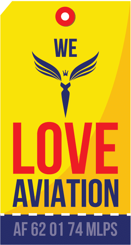
Having an affinity for yellow and dark blue (two colors heavily used in aviation, particularly commercial aviation), we created three versions – a fully colorized version (the blue spirit with the yellow field), a solid white version of the icon, and a wordmark – AviationAgency.
Everyone agreed that it felt right – clients and our people. It captured the spirit of who we were and what clients thought of us.
It embodied the freedom that flight enables and our passion for excellence and for bringing that feeling of freedom to a wide audience.
It became the symbol for who we are and where we’re going.
That’s how great branding is made.
This branding is also reflected in what we call the “commandment” of the Agency. It embodies what we think the freedom of flight enables. It’s what we see at the heart of our clients in why they do what they do. It’s why aviation exists. It is always there, hidden, and that is why it is hidden in various parts of our website, literature, and on our “swag.”
It is adapted from the song “Sogno di Volare” by Christopher Tin and the writing (possibly) of Leonardo DaVinci who wrote, “When once you have tasted flight, you will forever walk the Earth with your eyes turned skyward, for there you have been, and there you will always long to return.”
The “Commandment” is this (in Italian)
Come gli uccelli, verso il cielo
Una volta che avrai
spiccato il volo, deciderai
Lì a casa il cuore sentirai,
Glorioso per sempre!
Translated into English:
Like the birds up towards the sky
Once you have taken flight,
You will decide (for yourself)
That this is where your heart feels at home,
Glorious forever!
